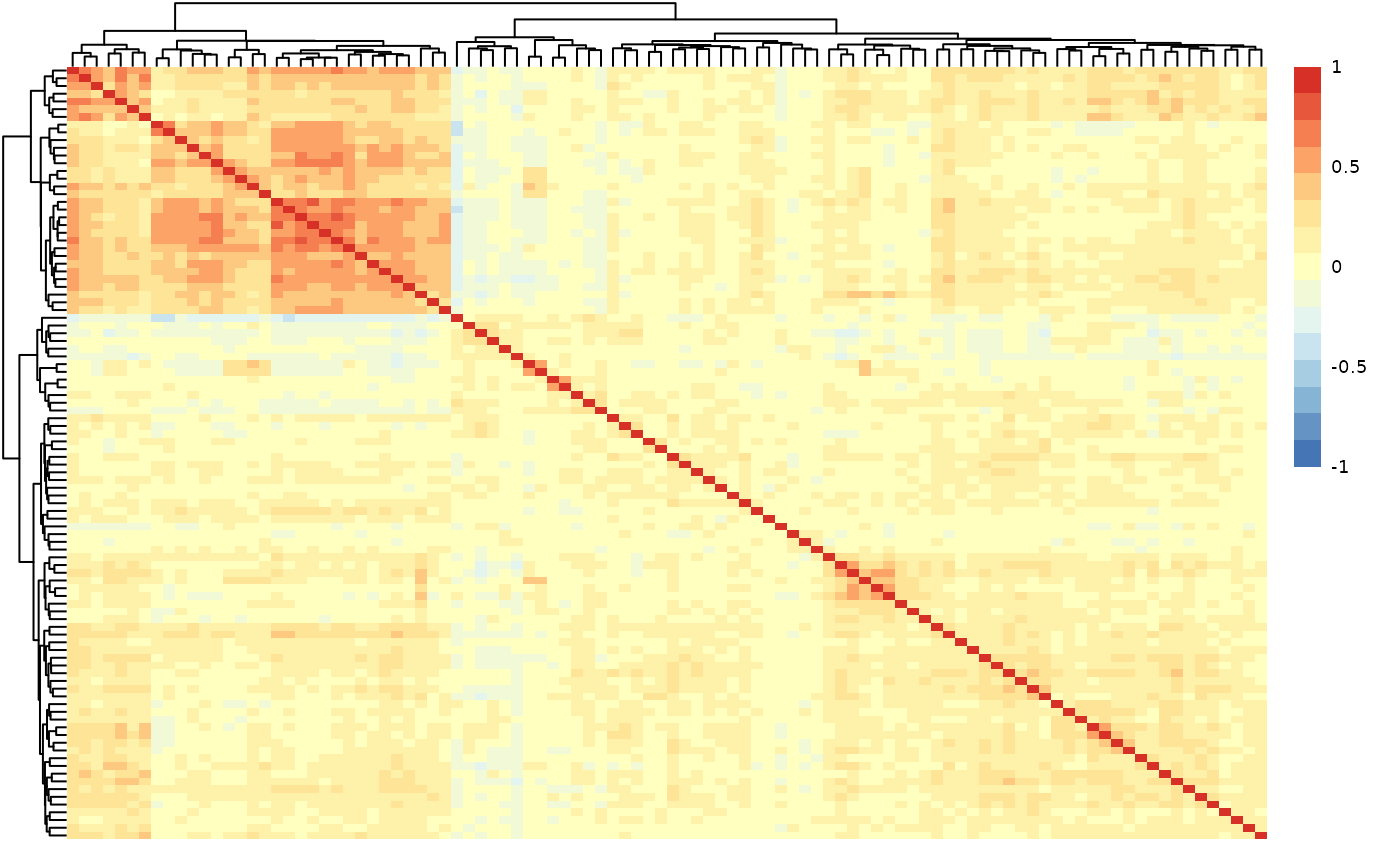
hd_plot_cor_heatmap() calculates the correlation matrix of the input dataset.
It creates a heatmap of the correlation matrix. This matrix is created via hd_correlate().
It also filters the feature pairs with correlation values above the threshold and
returns them in a tibble.
Usage
hd_plot_cor_heatmap(
  x,
  y = NULL,
  use = "pairwise.complete.obs",
  method = "pearson",
  threshold = 0.8,
  cluster_rows = TRUE,
  cluster_cols = TRUE,
  max_heatmap_features = 1000
)
Arguments
- x
A numeric vector, matrix or data frame.
- y
A numeric vector, matrix or data frame with compatible dimensions with
x. Default is NULL.- use
A character string. The method to use for computing correlations. Default is "pairwise.complete.obs". Other options are "everything", "all.obs", " complete.obs", or "na.or.complete".
- method
A character string. The correlation method to use. Default is "pearson". Other options are "kendall" or "spearman".
- threshold
The reporting correlation threshold. Default is 0.8.
- cluster_rows
Whether to cluster the rows. Default is TRUE.
- cluster_cols
Whether to cluster the columns. Default is TRUE.
- max_heatmap_features
The largest number of features to draw a heatmap for. Default is 1000. Above this the correlation matrix and the reported pairs are still returned, but the heatmap is skipped.
Value
A list with the correlation matrix, the filtered pairs and their correlation values, and the heatmap.
Details
Drawing the heatmap requires hierarchical clustering of every feature and a
cell per feature pair, both of which grow quadratically. Past a few thousand
features the plot stops being readable long before it stops being computable,
so max_heatmap_features caps it: beyond that the correlation matrix and the
reported pairs are returned as usual and cor_heatmap is NULL. Raise the
limit to force the plot, or subset the data to the features of interest.
Examples
# Prepare data
dat <- example_data |>
  dplyr::select(DAid, Assay, NPX) |>
  tidyr::pivot_wider(names_from = "Assay", values_from = "NPX") |>
  dplyr::select(-DAid)

# Correlate proteins
results <- hd_plot_cor_heatmap(dat, threshold = 0.7)

# Print results
results$cor_matrix[seq_len(5), seq_len(5)]  # Subset of the correlation matrix
#>        AARSD1  ABL1 ACAA1  ACAN ACE2
#> AARSD1   1.00  0.47  0.19 -0.06 0.04
#> ABL1     0.47  1.00  0.46 -0.01 0.13
#> ACAA1    0.19  0.46  1.00  0.03 0.32
#> ACAN    -0.06 -0.01  0.03  1.00 0.07
#> ACE2     0.04  0.13  0.32  0.07 1.00

results$cor_results  # Filtered protein pairs exceeding correlation threshold
#> # A tibble: 6 × 3
#>   Protein1 Protein2 Correlation
#>   <chr>    <chr>          <dbl>
#> 1 ATP5IF1  AIFM1           0.76
#> 2 AXIN1    ARHGEF12        0.76
#> 3 AIFM1    ATP5IF1         0.76
#> 4 ARHGEF12 AXIN1           0.76
#> 5 ARHGEF12 AIFM1           0.71
#> 6 AIFM1    ARHGEF12        0.71

results$cor_heatmap  # Heatmap of protein-protein correlations